3 Design Lessons to Steal from This Poppy Pink Kitchen in England

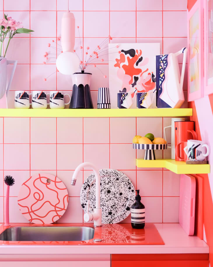
Tania James and her partner (aka Ms. Pink and Mr. Black) know all about playing with graphic artwork and bold color. Just take a look at their own fanciful, pink-and-red striped kitchen in the London Borough of Hackney, England! Together, Ms. Pink and Mr. Black are the creative duo behind Quirk & Rescue, an East London-based interiors and homewares brand that creates contemporary, colorful designs for the home.
The couple, along with their three sons, have lived in their eye-catching, converted Victorian flat for more than 19 years. Says Ms. Pink, a self-proclaimed pattern and color lover, “The best thing we ever did was not to limit the amount of color in our home — it’s made us feel so happy. The rest of the world may feel gray at times, but it’s always colorful here!”
We took the tour of the couple’s home, and found three super useful and fun design lessons worth stealing. Come along, and we’ll show you just what we mean!
Take the full tour: This Colorful London Home’s Pink and Red Striped Floors Aren’t Even the Most Fun Detail on Apartment Therapy
1. Color rules are meant to be broken.
The biggest challenge was deciding on how much color to infuse into the home, Ms. Pink explains. “But once we started going bold, bright, and neon, the rest was simple!”
While there are supposed theories to using color in design, Ms. Pink doesn’t pay any attention to them. According to her, there are two schools of thought when it comes to color: a cohesive, complementary palette and a clashing palette. “We love to mix up the two,” explains Ms. Pink, who added a neon pink-grouted floor tile to her red-and-pink kitchen. “With most things in life, color cohesion is opinion, not fact.” Ms. Pink offers this gem of advice: If you like two colors paired together — regardless of color “rules” — then they go together. It’s as simple as that.
2. Lighting affects how colors are viewed.
Lighting can make colors look different at different times of the day, says Ms. Pink. One good tip: “It’s really useful to paint a large piece of paper in your chosen color/colors and place on the area you want to paint to see how it looks at various times throughout the day,” she says.
For example, in specifically dark portions of the home, the couple painted with the brightest neon yellow they could find. “It really illuminates the area,” she explains. Plus, it adds a pop of bright color, too, as shown in the kitchen’s floating open shelves.
3. Going bold doesn’t have to be a commitment.
The key to using color is to start small (think: display objects or pillows). Even then, when buying something you like — if the color isn’t to your taste — buy it anyway and change the color yourself, Ms. Pink says. “Paint or spray that plant pot or cute ornament. Dye that cushion cover or bedspread. There are so many informative tutorials out there to show you how,” she says, pointing to her own DIY reupholstered kitchen chairs from eBay as examples.
But, above all, don’t be afraid to go bold. “Most small DIY projects are reversible! A paint color can be covered over if you decide you don’t like it,” she says.
This post originally ran on Kitchn. See it there: 3 Super-Fun Design Lessons to Steal from This Mega-Colorful Kitchen in England