See How I Transformed My Sad, Plain Entryway into a Jewel Box Vestibule (for About $750!)

One of my favorite details in my historic home is its original vestibule. In too many Victorian houses, the vestibule has been opened up to add a few square feet to the living room, and that tiny entryway — the only separation between outside and in — is totally lost.
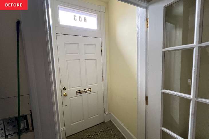
I’ll never understand the purpose of removing it. It’s not usable space beyond walking in the front door, so why not let it shine as its own little room? I was fortunate that the vestibule in my 1895 rowhouse had been maintained, including its original tile (or so we’ve been told), but it felt like a sad little pass-through.
It was a space that had potential — I mean, that tile! But the tired yellow walls and plain white doors felt underwhelming. There wasn’t even a light in the space. It sat there like a shell of what was probably once a lovely entryway that had somehow been lost to decades of neglect. Letting it shine turned into one of my favorite renovation projects. Here’s what I did.
I let the original tile guide the wallpaper choice.
When you have original tile that’s in decent shape, there’s practically a law that you must keep it. I happened to love the seafoam green color of the tile, so I was delighted to work around it. I ordered a slew of wallpaper samples and quickly decided that going dark was the right move for this space. The adjacent living room is the only white room in the entire house, so the contrast is necessary for it to hold its own.
A black trellis wallpaper from Rifle Paper Co. was the ultimate winner, and it perfectly picks up both the green tones from the tile.
The doors got a dark forest green paint makeover.
I don’t love a white door in any space, so all of the doors on my first floor are painted in this high-gloss Benjamin Moore Black Forest Green, made 50% darker. I wanted it close to black, but still reading as a dark, dark green. The high gloss reflects light so it doesn’t become overwhelmingly moody.
I added a ceiling medallion.
A ceiling medallion wasn’t in the initial plan, but I missed the return window on a medallion that didn’t work out in another space, so why not? It’s small enough for the space and adds a little bit more ornate detail to a room that’s designed to feel like a little jewel box. I’m not always a “more is more” person, but it definitely feels right here.
And speaking of borrowing from other rooms, when you’re a year into a major renovation that’s had starts and stops, there are inevitably pieces that were selected then discarded along the way. The light fixture in here is one of them. It was originally chosen for a different space, sat in an unfinished room for months, then finally found its home here. I’m a big believer in shopping your home first. You never know what you might have that could complete a styled space, and it saves money over buying another item.
I added a brass switch plate and other gilded details.
These vintage mirrors and the small brass bow were pieces I’d thrifted over the course of our renovation and tucked away for the perfect spot. The sizing of these items is tough — they could easily get lost in a larger room. But, in this tiny space, they become darling little details that add a dainty gilded touch to the space.
I also added a brass switch plate for the light. While I’m usually a fan of wallpapering over outlet covers and switch plates, continuing the gilded look felt right in here. I wish the Ring keypad wasn’t here, but, alas, modern technology sometimes wins out.
Oversized serif numbers make a statement.
On the outside, the final touch was swapping out the tiny house numbers that felt like an afterthought for oversized serif numbers that make a statement (and are easier to read!). I found these numbers on Etsy, but a word to the wise: Make sure you measure! I originally grossly overestimated how big the numbers should be and, thankfully, the Etsy shop owner intervened.
Now, I have a dramatic entrance to my home — and a space that friends stop and ask about as soon as they walk in. Best yet, the beauty of upgrading a tiny space is that it’s almost always budget-friendly and it’s quick, and that was definitely true for me. My total cost was around $750 (this includes pro wallpaper install) and the project took a weekend to complete — a couple of hours for the wallpaper, and an afternoon for the painting.
This article originally published on Apartment Therapy. See it there: See How I Transformed My Sad, Plain Entryway into a Jewel Box Vestibule (for About $750!)